Experiments with wallpaper of different colors make it possible to achieve an optimal balance in the sensations and perception of the room. Manufacturers of wallpaper always build their collections in such a way that among the entire assortment it was possible to pick up two or three ideally suited to each other kind. And not only colors can be combined, but also textures.
To learn how to combine colors of wallpaper in the interior, you need to remember the main rule: different types of wallpaper should be not only contrasting, but also have some common features. If you choose identical wallpaper colors that differ in color, they should also have a common ornament and texture.
The combination of wallpaper colors in the living room
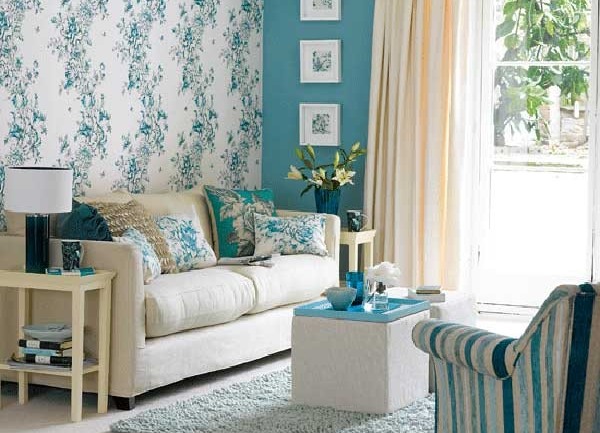
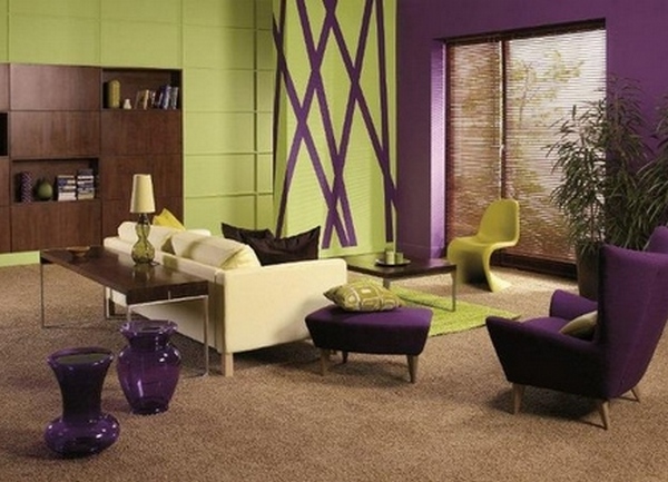
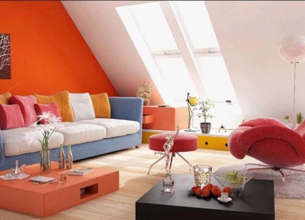
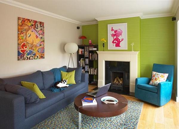
The living room is the most passable place, therefore all the owners strive to make it cozy and attractive. Such a design technique, as a combination of wallpaper can be a good move, only you need to be able to properly use it.
The main methods of combining different wallpapers in one room is the alternation of horizontal and vertical bands, as well as a combination of different shades of the same color. A more bold option is to use combinations of absolutely opposite colors for one room.
Since the living room is a place for active pastime, it is possible to put vivid experiments here. For example, try a combination of wallpaper colors such as green and purple. Also green fits well with orange. Such contrasts set the mood for the room.
| | | |
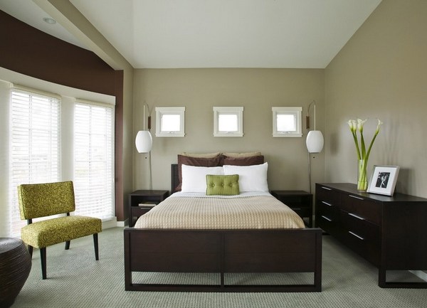
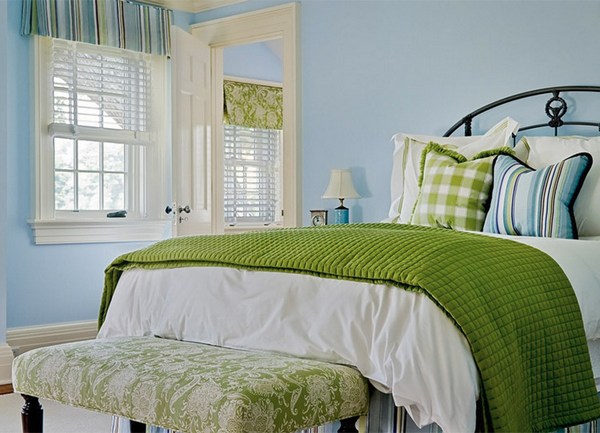
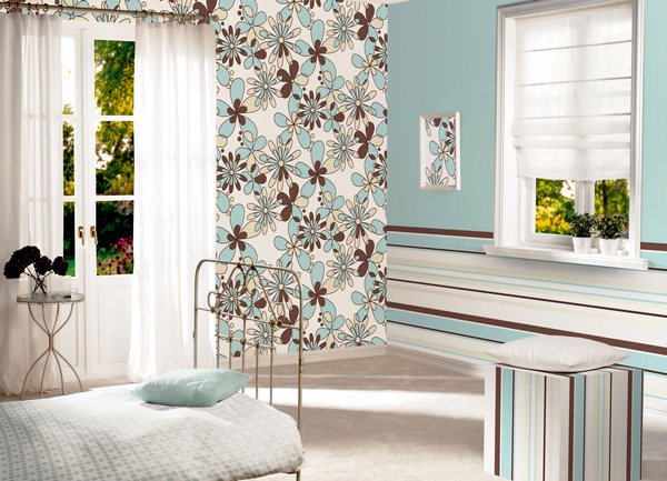
The combination of wallpaper colors in the bedroom
A bedroom is a place for a quiet rest, a night's sleep. There must be an atmosphere of romance and peace. Therefore, avoid combining contrasting and vivid colors.
Try a combination of beige wallpapers with brown, soft-turquoise, purple, pink. In principle, a neutral beige color fits well with most colors - both warm and cold. The only advice is to avoid combining beige and gray.
| | | |
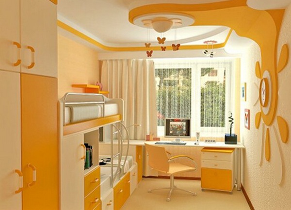
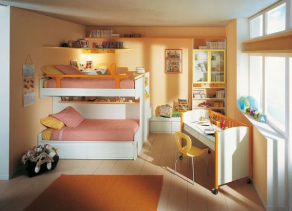
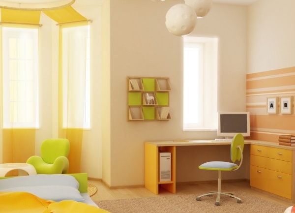
In the children's bedroom, you can try a combination of peach color wallpaper with a brighter mandarin, pumpkin, brick shades of orange. It turns out interesting and bright, but at the same time not working on the nerves of the interior.
| | | |
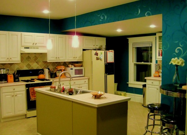
The combination of wallpaper colors in the kitchen
The kitchen is often decorated in several colors, but do not use more than 3 shades. And if the color of the kitchen set and the walls coincide, then the furniture should be of a different shade.
The combination of the color of furniture and wallpaper in the interior of this room is no less important than, say, in the living room, since the imbalance or monotonousness that has arisen can bring to naught all your efforts to create a designer interior.
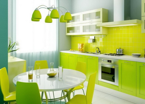
In the kitchen, colors and shades are best combined: orange and yellow, turquoise and beige, yellow and turquoise, green and orange. Try to avoid the combination of two cool colors of wallpaper and furniture, such as lilac and gray. This completely kills the appetite, which is unacceptable for the kitchen and dining room.
| | | |
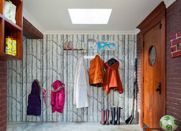
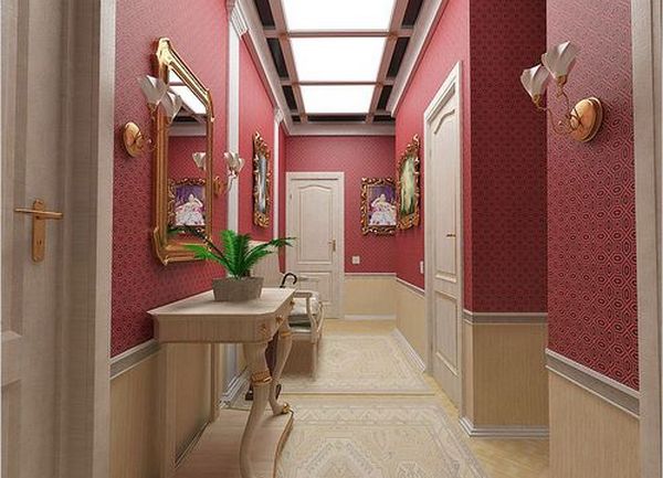
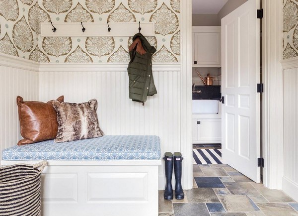
The combination of wallpaper colors in the hallway
In the hallway guests get in the first place, so it is important to immediately create a right impression about the owner of the home. For a narrow corridor, choose light and solid wallpaper in conjunction with a horizontal strip of darker on the bottom or top of the room.
Remember that cold shades will widen the hallway, and warm ones will make it more cozy. Allow yourself a few bright accents. The most successful combinations for the corridor: white with brown and dark chestnut, peach with red and terracotta, green with light blue, as well as black with white and chestnut.
| | | |