As is known, to create a successful design of a premise it is important that some of its elements interrelate and complement each other. That is why, in the planning of a stylish interior, special attention should be given to combining the colors of curtains and wallpaper.
Of course, we take into account the texture, pattern and style of these or other paintings. However, in the case of an incorrect, contradictory combination of wallpaper colors and curtains in the interior, the room may look dull and tasteless. To avoid similar embarrassments, in our article we will consider the most successful combinations of shades of these two separate elements.
The combination of colors of curtains and wallpaper in the interior
Surely, you already managed to notice how often in the world of design and creativity there are contrasts. Brightly painted walls or variegated curtains give the monotone interior expressiveness and a special charm.
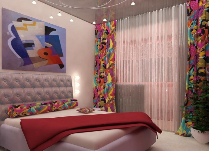
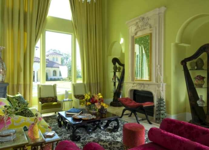
Contrast combination of colors of wallpaper and curtains in the interior is a common thing, however, in this case it is necessary to take into account some nuances. In order to avoid "vinaigrette" it is worth remembering that in the same room you can not use the same bright wallpaper and curtains. This will result in visual overload. For similar combinations of colors of curtains and wallpaper in the interior, you can use wallpapers of saturated tones: blue, green, orange , brown, while decorating the windows with curtains of light shades of beige, sandy, silvery hues. So, in a room with silver walls, turquoise, pale pink or light yellow curtains look good.
| | | |
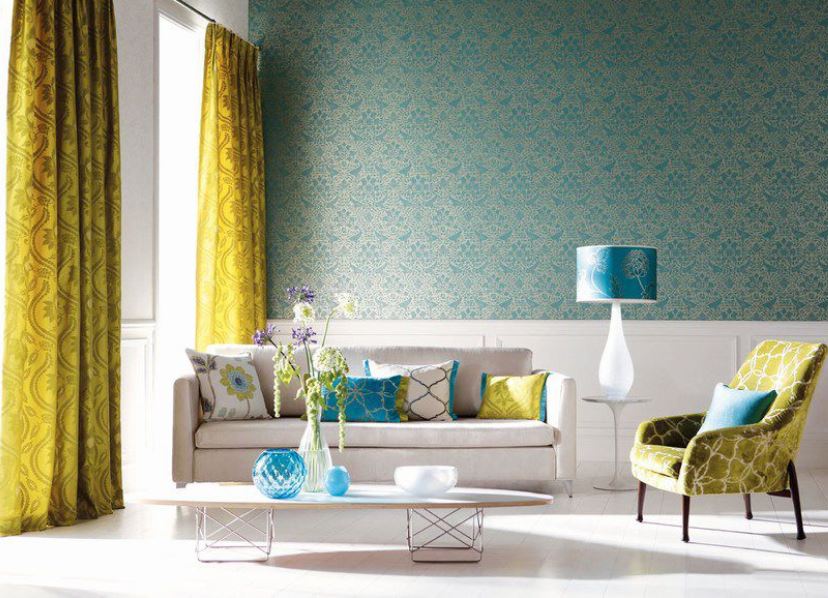
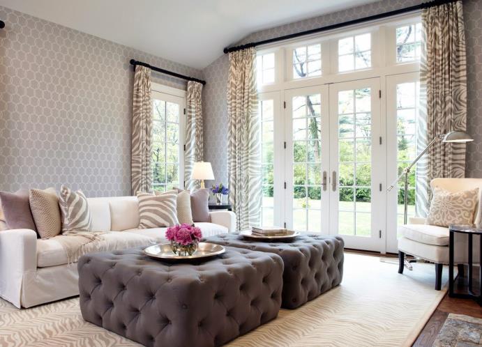
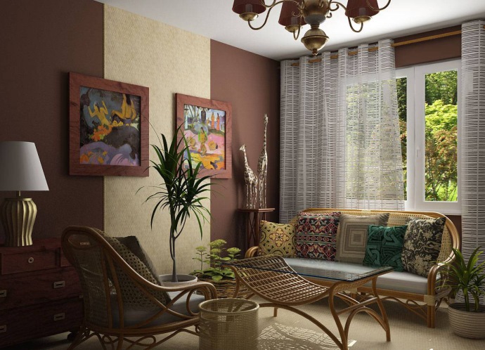
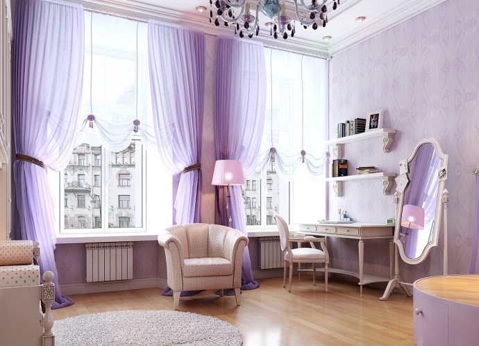
A combination of wallpaper colors and curtains such as "neutral walls and flashy windows" is considered to be successful. In this case, when the walls are covered with monophonic wallpaper of light, almost pale tones, the curtains, on the contrary, have a bright and color print, which enliven the interior.
| | | |
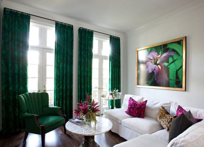
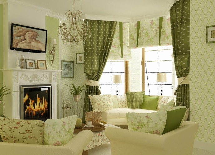
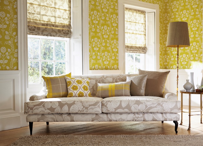
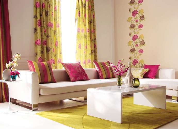
The theme of "catchy wallpaper and neutral curtains" is suitable for more spacious rooms. Calm and "light" shades of curtains look harmoniously against the background of juicy, colored wallpaper.
| | | |
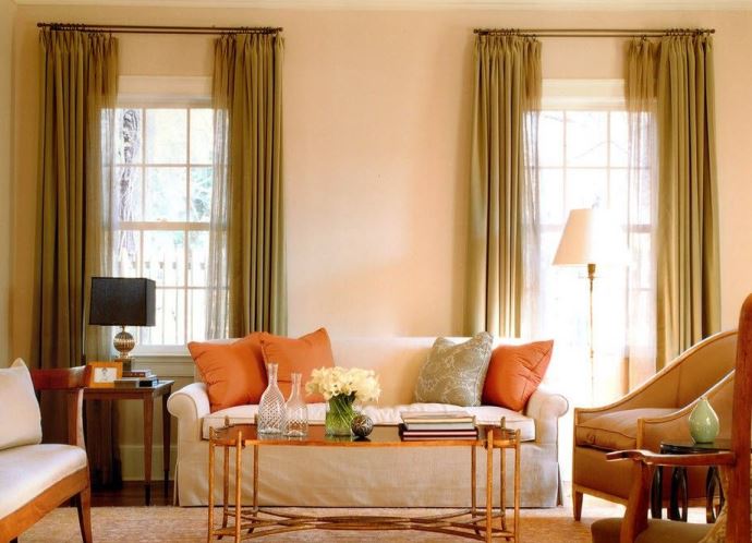
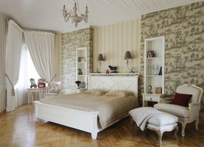
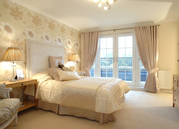
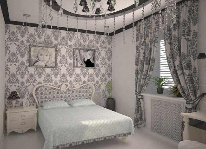
A classic option for combining colors of curtains and wallpaper in the interior is a combination of "tone-to-tone . " This design option - the easiest, because pick up curtains of the same shade as the wallpaper, not difficult. So that they do not merge with the walls, it is better to hang the curtains on a lighter or darker tone.
| | | |
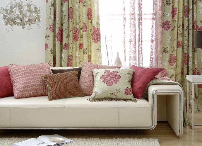
Also very attractive in the interior is the combination of colors of curtains and wallpaper with a similar pattern. Then, the drawing, on the curtains, is duplicated in a single form on the walls, and vice versa.
| | | |