To some, it seems too bright and sharp, and someone says unconditional "yes" to this daring shade of the sun. So ambiguous, but at the same time, certainly attracting the attention of the orange color in the interior becomes one of the main modern decorative trends. It allows you to create some particularly warm atmosphere, which constantly keeps the feeling of hot summer, and involuntarily lifts the mood to all those who are in these orange walls.
What is the color of the orange?
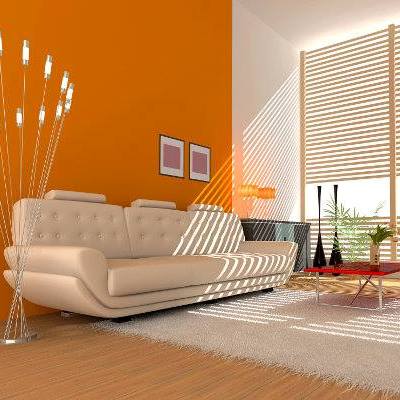
Having decided to fill the room with such juicy colors, it is important to take into account a number of important points. One of the main issues is the question of the combination of orange in the interior. After all, the main thing here is not to overdo it. Orange in any room will be a color "king", to which all attention is riveted, therefore, it is much better when it is an accent, rather than occupying the entire space.
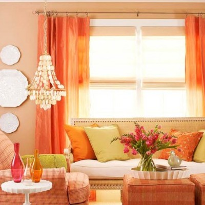
Olive , white, beige, noble light brown, gray, soft blue, light green will counterbalance some aggressiveness of this shade. And then the combination of colors in the interior with orange will be harmonious and stylish. It can be expressed in pillows, rug, frames, curtains or furniture items.
Orange color captures the territory
Perhaps there is no place in which this shade could not be used:
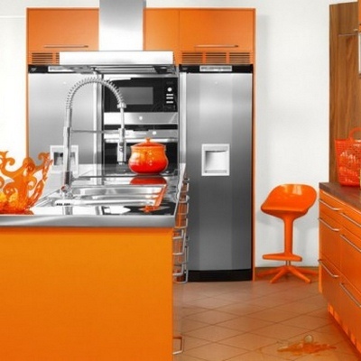
- Orange color in the interior of the kitchen , settling on the table top, cabinets, furniture, or becoming the main shade of all instruments present, in any season will create an island of summer /
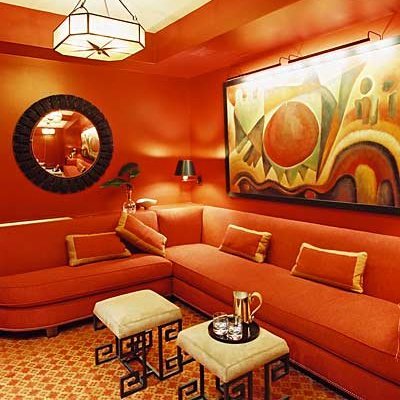
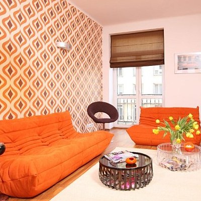
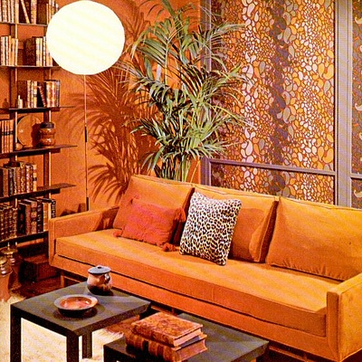
- Orange color in the interior of the living room , especially if the rest of the rooms are made in cold pastel colors, will please the guests and the owners of the house no matter what the weather is outside the window. However, it is desirable that the room is on the shady side, because otherwise the excess of light and color can be superfluous.
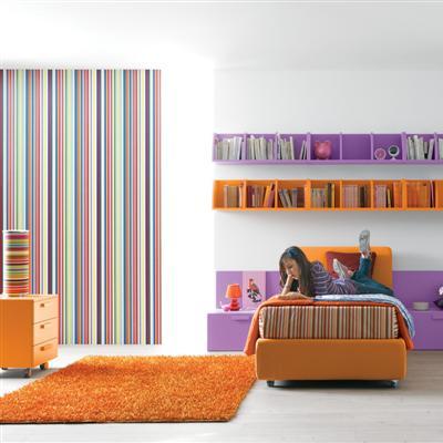
- Orange color in the interior of the bedroom will suit people energetic and wishing to relax in a bright, not in a quiet room; To choose such an expressive shade as the main one is to decide not on peace and pacification, but on constant activity.
| | | |
| | | |
| | | |
| | | |
In general, it can be said that it is better when a bright shade accentuates the muffled tones and the eyes "do not cut" the abrupt transition. That is why the orange color of the interior should be portioned, dosed. After all, what if not a sense of proportion is the main indicator of a truly good taste.