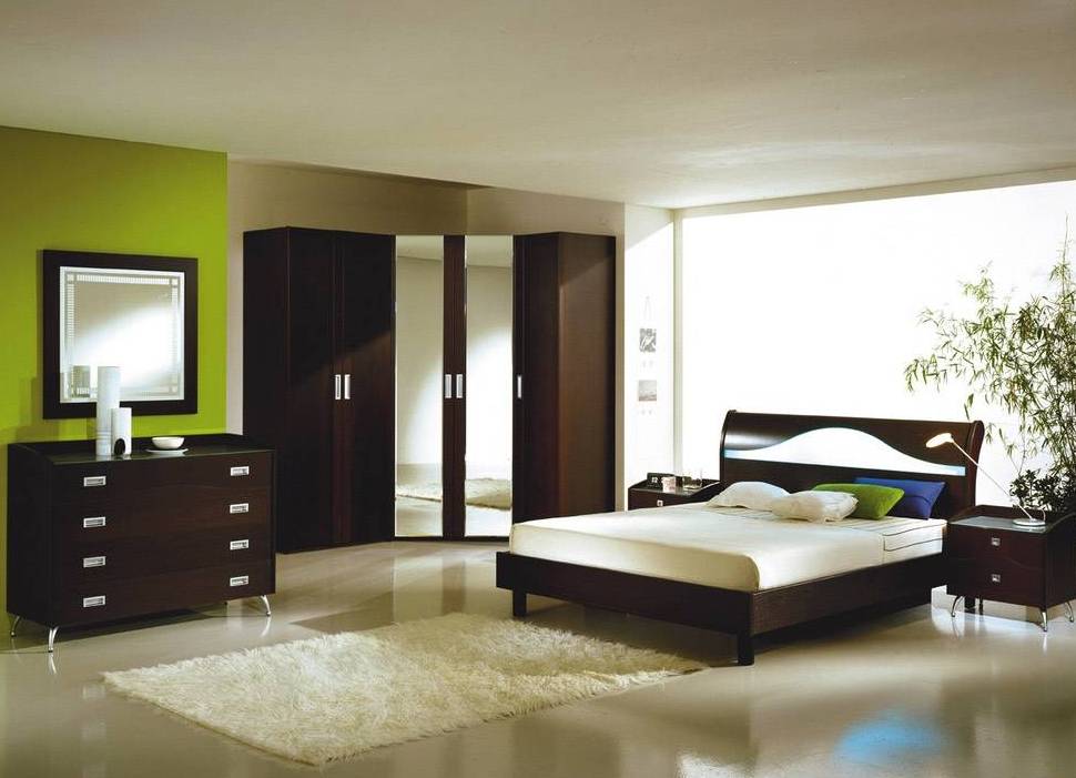
Once it was fashionable to use in the interior a combination of all kinds of colors and shades. But times have changed. In place of gloss and glamor came the style of clear lines and minimalism. However, minimalism is rich and even luxurious, but rather discreet. If not a symbol, then certainly one of the attributes of high tech became wenge.
Wenge as a tendency
For those who make wooden furniture, floor coverings, wenge causes quite a definite association. This is the name of the most expensive breed of wood. You can meet this tree plant in the humid forests of Congo, Cameroon and some other countries of the African continent. Its wood is so expensive that only very rich people can afford furniture or flooring from it. The use of wenge pr decoration interior is considered a top taste.
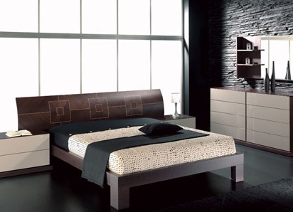
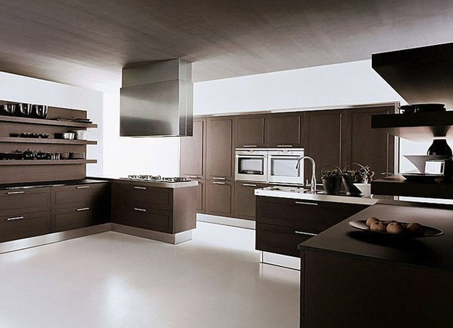
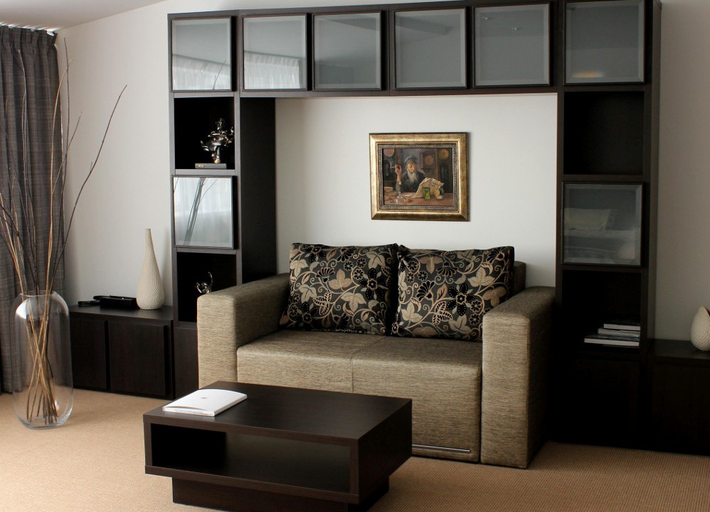
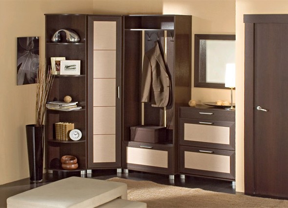
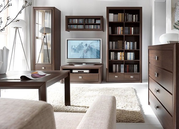
In addition, wenge - a color, more precisely, a shade that has depth. There are several shades of options on the theme of Wenge. The main one is easily recognizable - natural coffee. His unobtrusive saturation and aristocratism do not leave anyone indifferent. The color of wenge in the interior is also found in combination with other colors. So, interior designers are especially fond of chocolate, dark purple, almost eggplant, and dark cherry shades of wenge. Each of them is individual, but all of them amaze with their strict refinement and nobleness.
The combination of wenge colors
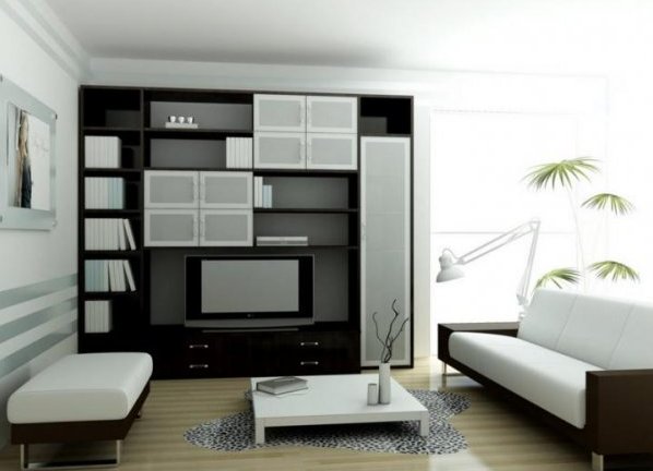
As black is perfectly combined with black, and white - with white , so it is possible and even recommended a combination of colors, more precisely, shades of wenge. For example, if the furniture is a dark purple wenge, then the floor can be made of a dark cherry or chocolate wenge parquet. Do not forget about the sense of proportion when drawing up the color palette of the interior. So, if the main tone is dark, then it simply needs to be diluted with light strokes, otherwise instead of a stylish living room we will get a gloomy and uncomfortable den.
| | | |
The combination of wenge with other colors
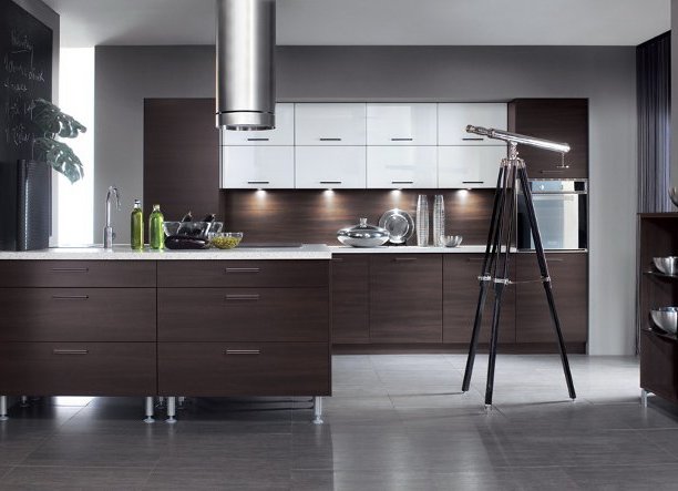
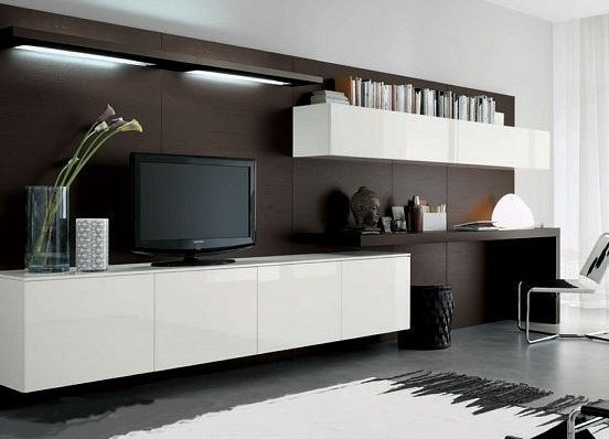
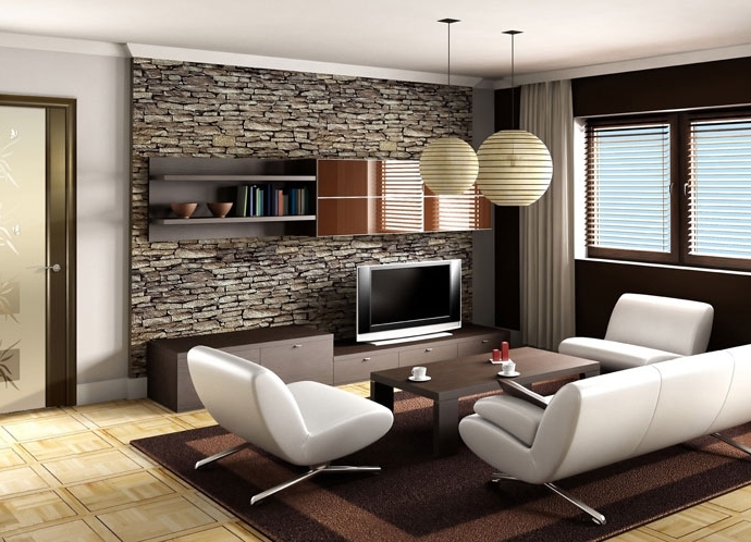
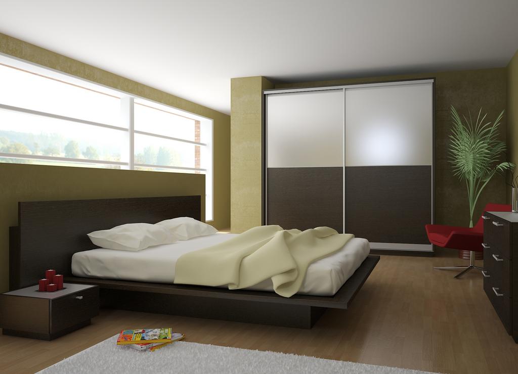
With the color wenge it is possible to combine colors of a light palette. All designers know about this and work in this direction. The main trend is this: dark wenge is in harmony with pastel tones. For example, the same furniture of a shade of a chocolate wenge will look great against a background of white or cream walls.
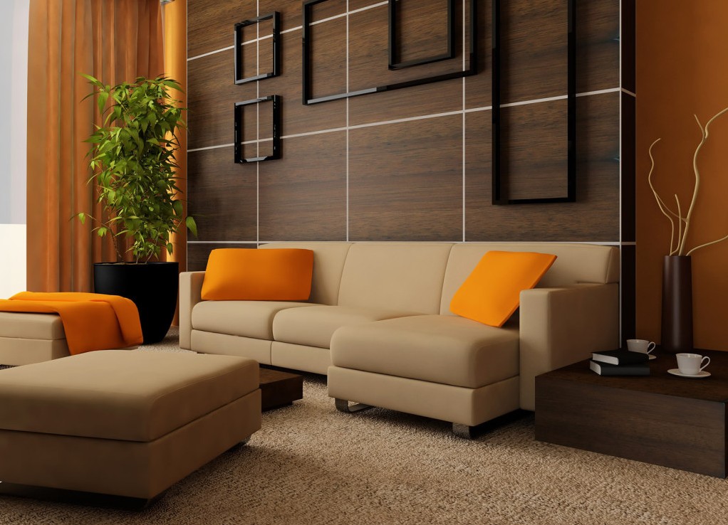
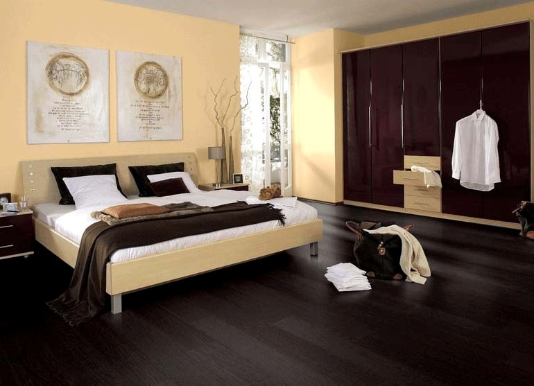
And a few more interesting combinations of wenge with other colors. So, a rare dark-violet its shade very well in harmony with the cold tones of the green-blue color scheme. But the rather popular dark cherry will look great on the fot of warm orange or peach and their shades. The main task of the designer when working with a wenge is to shade and emphasize it, rather than dissolve in it. After all, chocolate is sometimes too much.
| | | |
| | | |
| | | |